
In trading, visualizing market data effectively is key to making smart decisions. Charts are more than just images, they’re tools that turn raw numbers into actionable insight. Whether you’re tracking price action, volume, or trends, selecting the right chart type can make all the difference in how you interpret the market.
Among the most commonly used chart types by traders are line charts, bar charts, area charts, and candlestick charts. Each serves a unique purpose depending on your trading style and analytical goals. This guide breaks down these four essential chart types, their structures, strengths, weaknesses, and how traders typically use them in the real world.
Line Charts
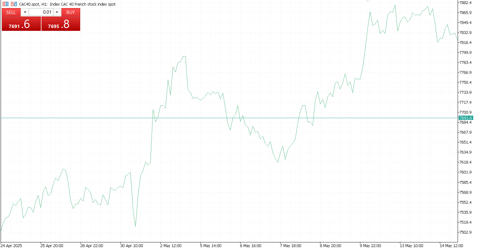
Line charts are a common feature in trading platforms, used to visualize the movement of asset prices over time. They work by connecting the closing prices of an asset over a selected time period, such as minutes, days, or weeks, using straight lines. The horizontal axis (X-axis) represents time, while the vertical axis (Y-axis) shows price. Each point on the chart corresponds to a closing price, and when these points are connected, they form a continuous line that reveals the asset’s overall direction.
These charts are particularly useful for identifying general market trends, comparing the performance of different assets, and assessing the long-term performance of investments. Their simplicity makes them easy to read and interpret, especially for trend analysis, as they eliminate much of the noise found in more complex chart types.
However, line charts have limitations. They only show closing prices and do not include information about opening prices, highs, or lows. This lack of detail makes them less effective for intraday or high-frequency trading, where more granular price data is necessary. Despite this, their clean, minimalist design makes them ideal for getting a quick and clear view of market direction.
Bar Charts
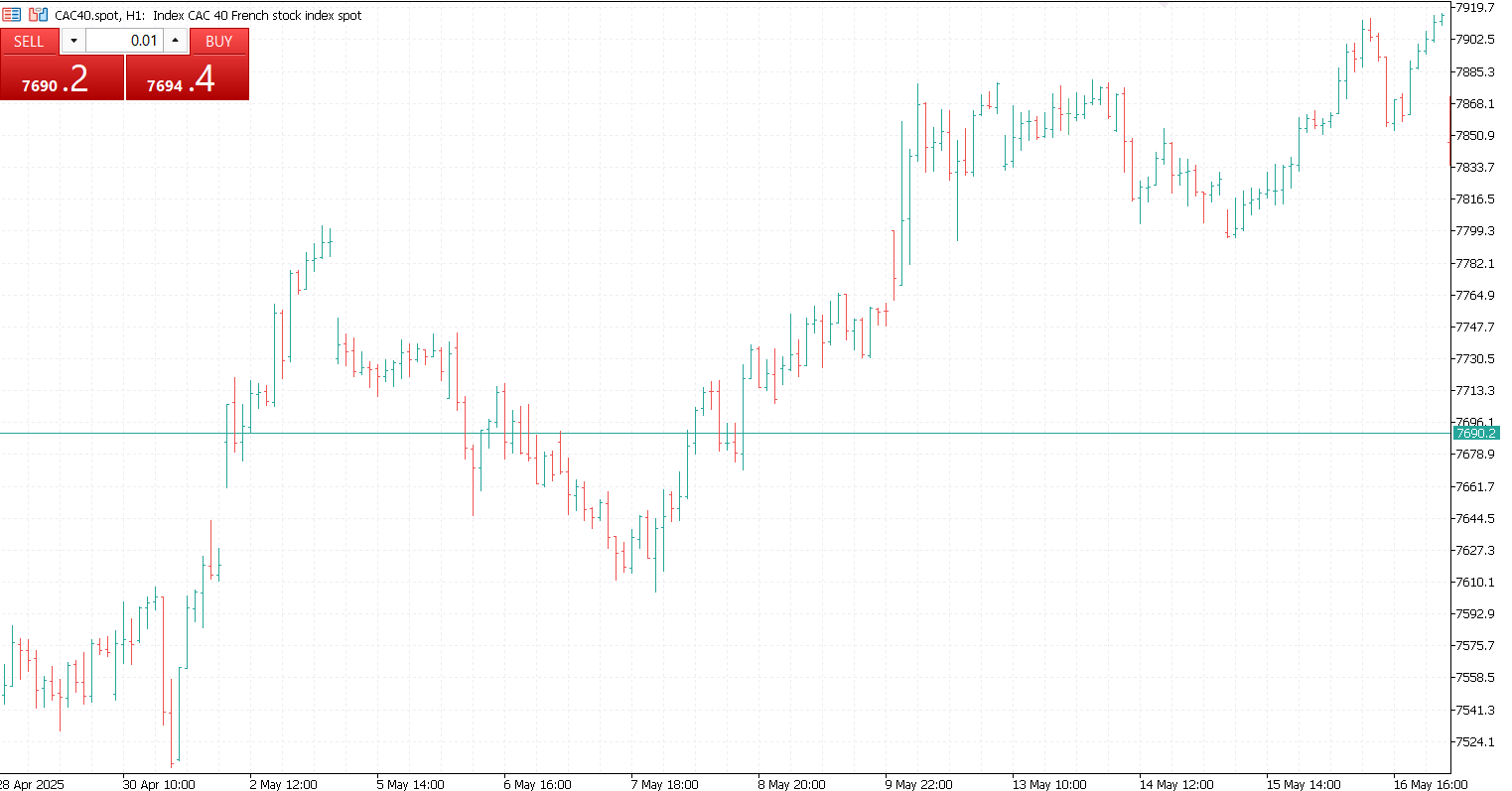
Bar charts offer more detailed information than line charts by displaying the open, high, low, and close (OHLC) prices for each time period. This makes them especially useful for analyzing market strength and volatility. Each bar consists of a vertical line that represents the price range from the low to the high during a given period. Small horizontal ticks on the left and right sides of the bar indicate the opening and closing prices, respectively.
In trading, bar charts help identify price ranges, assess volatility, and analyze historical price patterns. They can also be useful in confirming trends or signaling potential reversals. Because they include more data than line charts, bar charts are a valuable tool in technical analysis and can help traders recognize shifts in market momentum.
However, bar charts can be slightly more difficult to interpret at a glance, especially for beginners. They are also less visually intuitive than candlestick charts, which present the same information in a more graphical format. Despite this, their level of detail makes bar charts a solid choice for traders seeking deeper market insights.
Area Charts
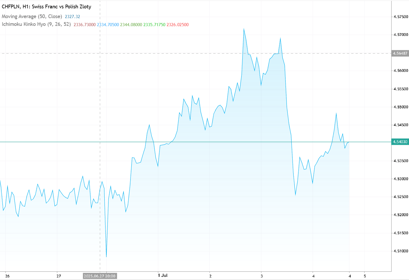
Area charts are similar to line charts, with the key difference being that the area beneath the line is shaded. This added shading makes them visually engaging and helps emphasize the magnitude of price movements over time. In trading, area charts are commonly used on platforms or dashboards to give a quick visual impression of market trends.
Structurally, they function like line charts, showing the progression of closing prices over time. However, the filled-in area below the line helps highlight overall growth or movement. Area charts can also be stacked or layered to compare multiple instruments or data series, making them useful for visualizing broader trends or portfolio performance.
Traders often use area charts to display cumulative returns, portfolio growth, or trends in trading volume and market indexes. The shaded area draws attention to the total change over time, which makes them particularly effective for showing overall progress or comparing different assets.
Despite their strengths, area charts are not ideal for precise price analysis. When multiple shaded areas overlap, the chart can become visually cluttered and harder to interpret. This makes them less suitable for detailed or high-frequency analysis but valuable for overviews and visual summaries.
Candlestick Charts
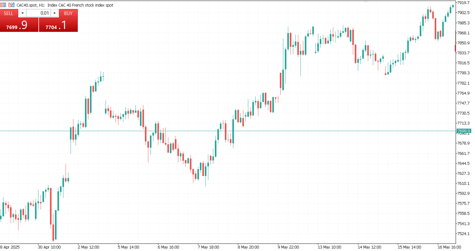
Candlestick charts are the gold standard in trading because they provide rich price detail and are a key tool in technical analysis. Each candlestick represents a specific time period and shows the open, high, low, and close prices, with its body indicating the range between the open and close. The wicks, or shadows, show the highest and lowest prices during the session. A green candlestick signals a bullish move where the close is higher than the open, while a red candlestick indicates a bearish move where the close is lower.
Traders rely on candlestick charts to interpret price action and market sentiment. They are essential for identifying well-known patterns such as the Doji, Engulfing, and Morning Star, which can offer insight into potential reversals or continuations. These charts are especially useful for timing entry and exit points in both short-term and long-term strategies.
Candlestick charts offer the advantage of detailed price information and support a broad range of pattern recognition techniques, making them ideal for short-term and intraday trading. However, they come with a steeper learning curve and can be overwhelming for beginners. They also require contextual understanding and confirmation from other indicators or chart patterns to be truly reliable.
Ultimately, the way you visualize market data can influence your trading decisions. Line charts offer simplicity and help highlight overall trends. Bar charts provide more detail than lines but are less visually complex than candles. Area charts give a quick snapshot of overall movement or volume trends. But when you’re ready to explore deeper technical insights and price action, candlestick charts are the go-to tool.
By mastering these foundational chart types, you’ll gain clearer insight into the markets and develop sharper trading instincts, no matter what asset or timeframe you’re working with.


