
In the dynamic and fast-paced world of forex trading, the ability to read and interpret charts is one of the most critical skillsfor success. Forex charts allow traders to visualize historical price data, identify trends, and make informed decisions based on technical analysis. While there are many types of charts available, three remain the most popular among traders of all levels: line charts, bar charts, and candlestick charts.
Each chart type has its unique strengths and is suitable for different trading styles and strategies. In this article, we’ll take a closer look at each of these chart types, their structure, advantages, and how traders use them to gain insights into market behavior.
1. Line Charts: Simplicity for a Clear View
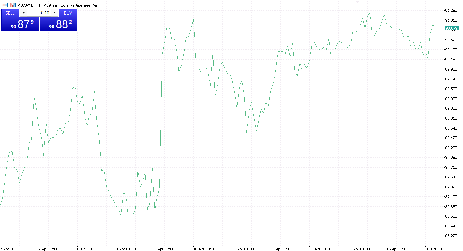
A line chart is the most straightforward of all forex chart types. It represents the price of a currency pair over time by connecting a series of closing prices with a continuous line. Typically, the x-axis displays the time period (from seconds to months), while the y-axis shows the price level.
Most line charts are based on the closing price of each time interval because it is considered the most important price point for traders. This simplicity makes it a favorite for beginners or for anyone seeking a clear overview of the market without distractions.
Benefits of Line Charts
- Clarity and simplicity. Ideal for identifying the overall trend without being overwhelmed by market noise.
- Great for long-term analysis. Offers a broad perspective for position traders and long-term investors.
- Efficient for comparison. Easy to compare the performance of multiple currency pairs or other assets.
Limitations
- Lack of detail. It shows only the closing price, omitting crucial data such as the opening, high, and low prices.
- Not ideal for intraday trading. Scalpers and day traders may find it lacking the depth needed for fast decision-making.
When to Use Line Charts
Line charts are best used when a trader wants to assess long-term trends or make broad comparisons. They are particularly useful for weekly or monthly analysis and in situations where simplicity and a big-picture view are more important than fine detail.
2. Bar Charts: A Classic Tool for Price Analysis
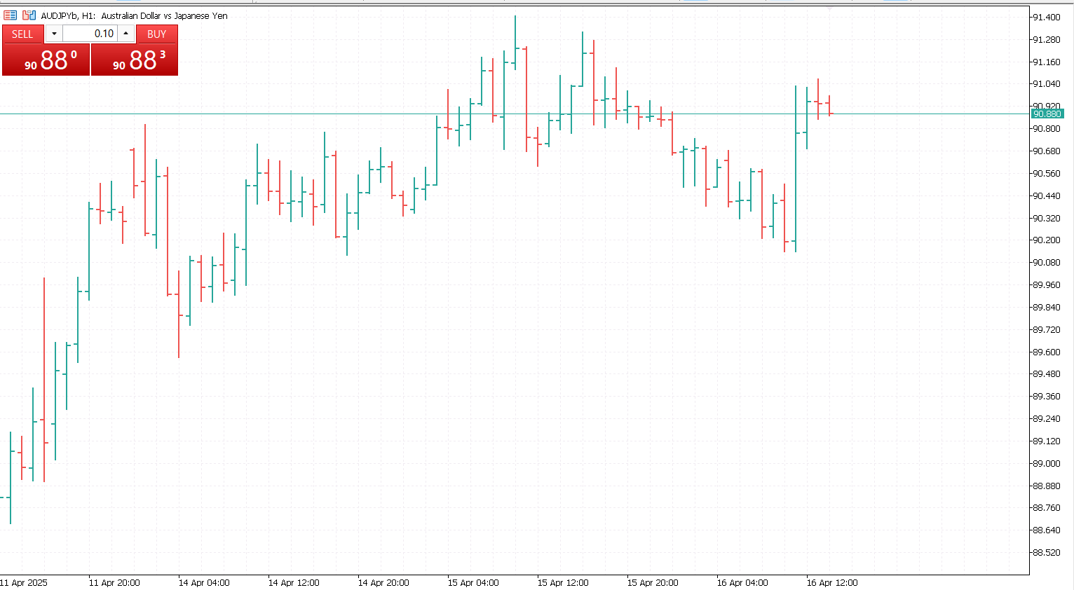
A bar chart, also known as an OHLC chart (Open, High, Low, Close), provides much more information than a line chart. Each vertical bar represents a single time period (for example, one hour or one day) and displays the following four key data points:
- Open: The horizontal tick on the left side of the bar
- High: The top of the vertical line
- Low: The bottom of the vertical line
- Close: The horizontal tick on the right side of the bar
This format gives traders insight into the price range and volatility during each period.
Benefits of Bar Charts
- Detailed information. Offers a comprehensive look at price movement within each time frame.
- Trend and volatility clarity. The high and low points give clues about market sentiment and volatility.
- Efficient for identifying patterns. Useful for recognizing formations like inside bars or reversals.
Limitations
- Harder to read for beginners. With no color coding and a more technical look, bar charts can be intimidating at first.
- Less visually intuitive. Compared to candlestick charts, bar charts require more practice to interpret quickly.
When to Use Bar Charts
Bar charts are a good choice for experienced traders who rely heavily on technical indicators and want precise data. They are especially useful for short- to medium-term trading strategies, including swing trading and breakout trading.
3. Candlestick Charts: The Preferred Choice of Most Traders
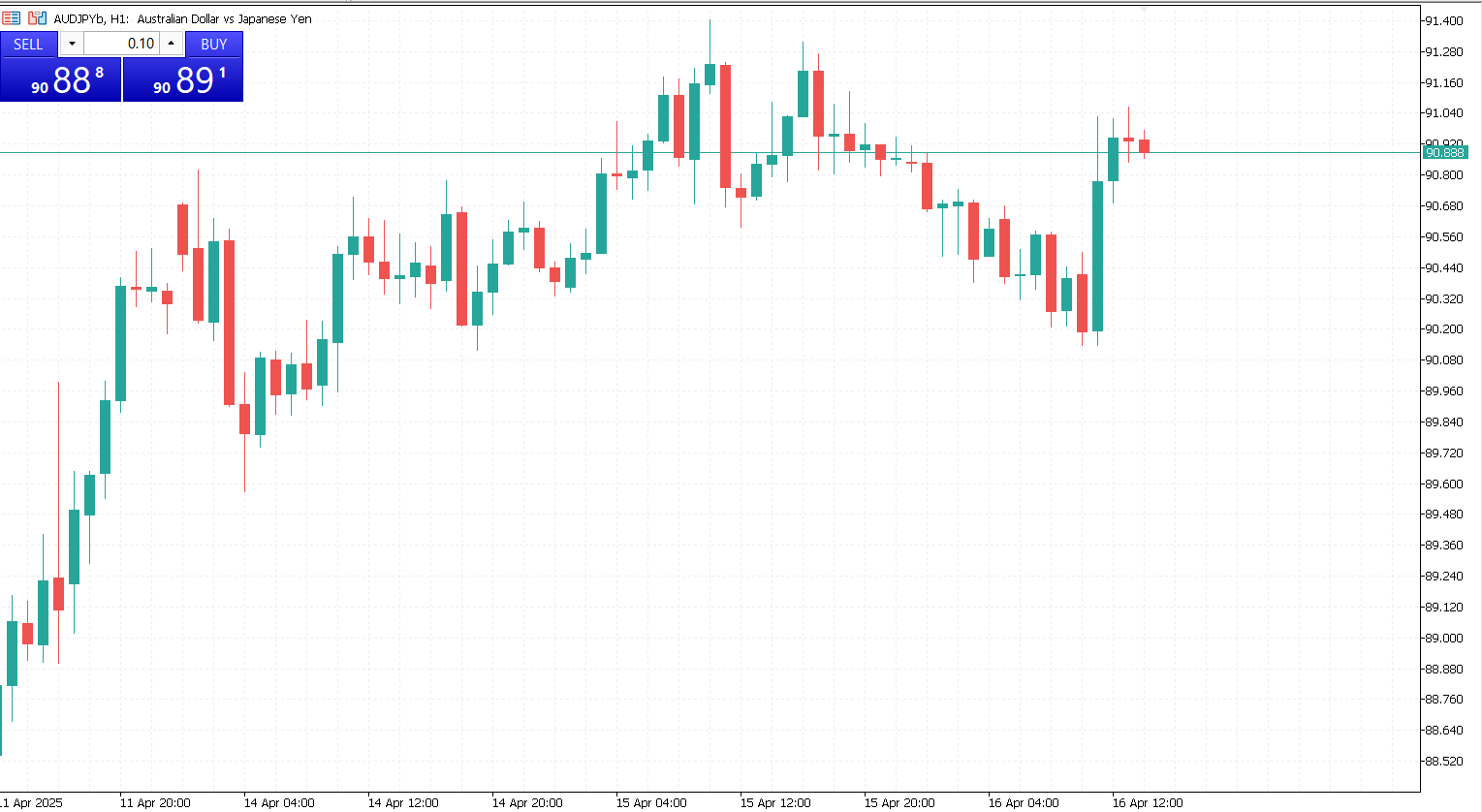
Candlestick charts are arguably the most popular type of chart in forex trading today. Originally developed in Japan over 200 years ago, they offer the same information as bar charts (open, high, low, close) but in a more visually appealing and intuitive format.
Each candlestick consists of:
- Body. Represents the range between the open and close price.
- Wick (or shadow). The line extending above and below the body, showing the high and low of the period.
- Color. Typically, green or white candles indicate a price rise (bullish), while red or black candles signal a price drop (bearish).
Benefits of Candlestick Charts
- Visual clarity. Easily interpretable at a glance due to color coding and distinct shapes.
- Pattern recognition. Supports identification of hundreds of well-known patterns (e.g., doji, hammer, engulfing).
- Adaptable to all timeframes. From minutes to months, candlestick charts are used across all trading styles.
- Widely used. Most trading platforms and technical analysis tools are designed with candlesticks in mind.
Limitations
- Can be overwhelming for beginners. With so many possible patterns, it’s easy to overanalyze or misinterpret signals.
- Requires context. Patterns don’t always work in isolation, they must be considered within the broader trend and market context.
When to Use Candlestick Charts
Candlestick charts are suitable for virtually all types of traders. Day traders, scalpers, swing traders, and even long-term investors rely on candlesticks for decision-making. They offer the perfect balance of detail and readability, making them a standard choice in the trading community.
Each chart type has its strengths and is suitable for different purposes. Line charts are best for a clean and simplified view of market trends. Bar charts are excellent for traders who value precision and detailed price data. Candlestick charts, however, strike the best balance between information and readability, making them the preferred choice for the majority of forex traders.
Understanding how to read and interpret these charts is foundational to mastering forex trading. By selecting the right chart type for your trading style and combining it with technical analysis tools, you can improve your timing, identify patterns early, and make more confident decisions in the market.


